Increasing reader loyalty through health education and resources
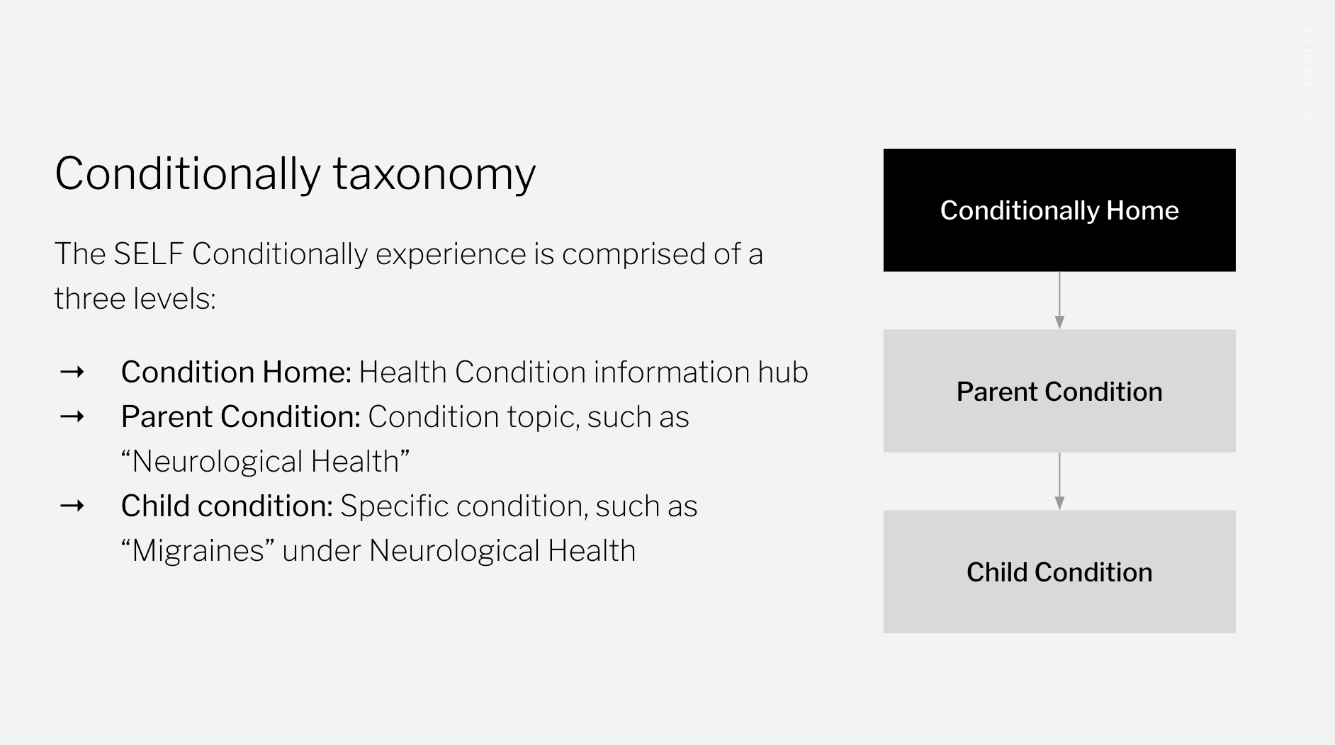
Our product team worked with SELF and in-house SEO experts to introduce the SELF Conditionally expererience; a hub spotlighting health condition-related editorial content supported by the SELF Medical Advisory Board.

Brand
SELF
Time
Q1 2022
Services
Product Design
SELF
Time
Q1 2022
Services
Product Design
Team
Product Design: Jazzmyn Coker
Product: Brian Gottesman, Marylou Alvarez
Engineering: Mithun Sathyan, Sumit Maurya, Moshina Thajudeen, Harsha Somarajupalli, Jyoti Singh
Product Design: Jazzmyn Coker
Product: Brian Gottesman, Marylou Alvarez
Engineering: Mithun Sathyan, Sumit Maurya, Moshina Thajudeen, Harsha Somarajupalli, Jyoti Singh
Outcomes
- Scalable Medical Advisory Board/Contributor page
- Variations to existing components
- SEO improvements, increased traffic and Average Time on Page

Introducing Conditionally
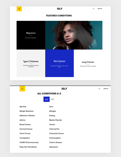
Conditionally in its previous state was not on Verso (the Design System at Condé Nast) and had a disorganized taxonomy and a cluttered user-experience. The editorial team had an objective to increase SEO and revenue by driving traffic to health related content.
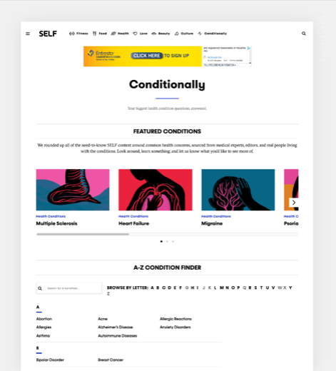
This experience is now backed by a design system and utilizes many additional features, such as a search tool within the Condition Finder to help guide users to information about health conditions. All components, including the Condition Finder were built with SEO in mind to improve SELF’s search-engine rankings and ultimately reach a wider audience and meet business goals.
Before (Legacy)
![]()
After (Design System)
![]()
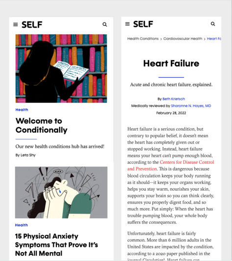
Conditionally ![]()
New Features
The new Conditionally health information hub on a design system has many new features:
- Conditions search tool
- More content packagaing capabilities
- New Medical Advisory Board page
- Video
- Growing library of SEO-optimized health content
Medical Advisory Board
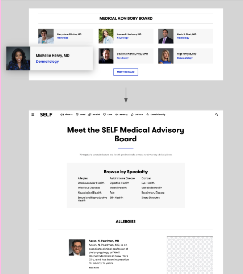
Along with optimizing the Medical Advisory Board component on the landing page, we developed a new page to introduce the SELF team of medical experts
- Members of the Medical advisory Board serve as contributors to health condition related content
- Contributor type added in Copilot
- By creating the medical advisory board page, we created a contributor page template on Verso available for use by other brands, such as Vogue.
Bringing health conditions to the Conditionally Landing Page
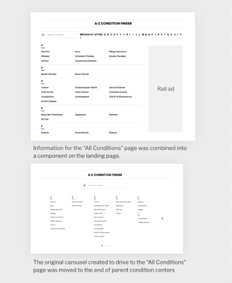
An “All Conditions” page was originally scoped but was later moved to “Conditionally Home”
- Conditions search tool now used on landing page and parent pages
- SEO improvement
- User-experience improvement
- Original carousel moved to parent pages for recirculation due to SEO priotization
Leveraging an existing component for the Condition Finder feature
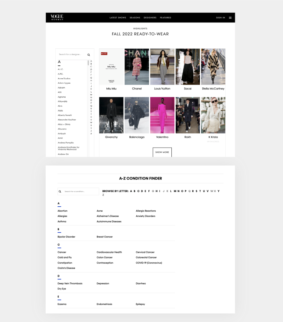
The A–Z finder list & A–Z carousel has been derived from the existing component “Curated Shows” by Vogue and consists of both legacy and Verso migrated conditions by adding the health-conditoin taxonomy to both legacy and Verso.
Carousel mid-content injection on parent pages
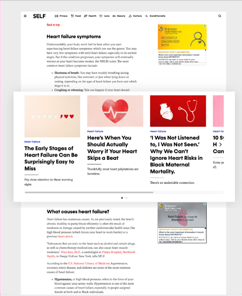
A call was made later to improve S EO and user-experience by injecting a SummaryCollage component into the middle of parent conditions
- SEO improvement
- Recirculation as a user-experience improvement
- Editorial guidance before scoping was to be content and link rich
Overview
The challenges our team encountered during this project were all learning outcomes – one challenge being conflicting objectives of SEO, revenue, editorial and the needs of users. Later in the project, objectives shifted to make SEO more of a priority. Our team was able to leverage this challenge to make our product even stronger by moving the original condition finder carousel to parent pages for reciruclation and modifying an existing carousel component to house conditions on the experience’s landing and parent pages.
SELF has seen a growth in audience, engagement and revenue from our team’s UX improvements to the SELF Conditionally channel. These improvements saw increases in unique page views, average time spent on page and a decreased bounce rate, which exceeded our team’s starting baseline and target goals.
